Levelling productivity by redesigning a desktop client around how users actually work
UX Research
Customer Insights
Developers & QA
Designers
About
Native Instruments is a global leader in music and sound design hardware plus software technologies used by entities like Deadmau5, P!nk, Alicia Keys, Hans Zimmer, and many others.
Challenge
The physical and digital product ecosystem operates via Native Access, a desktop application used by more than 1.5 million customers to install, activate, update, and manage Native Instruments products.
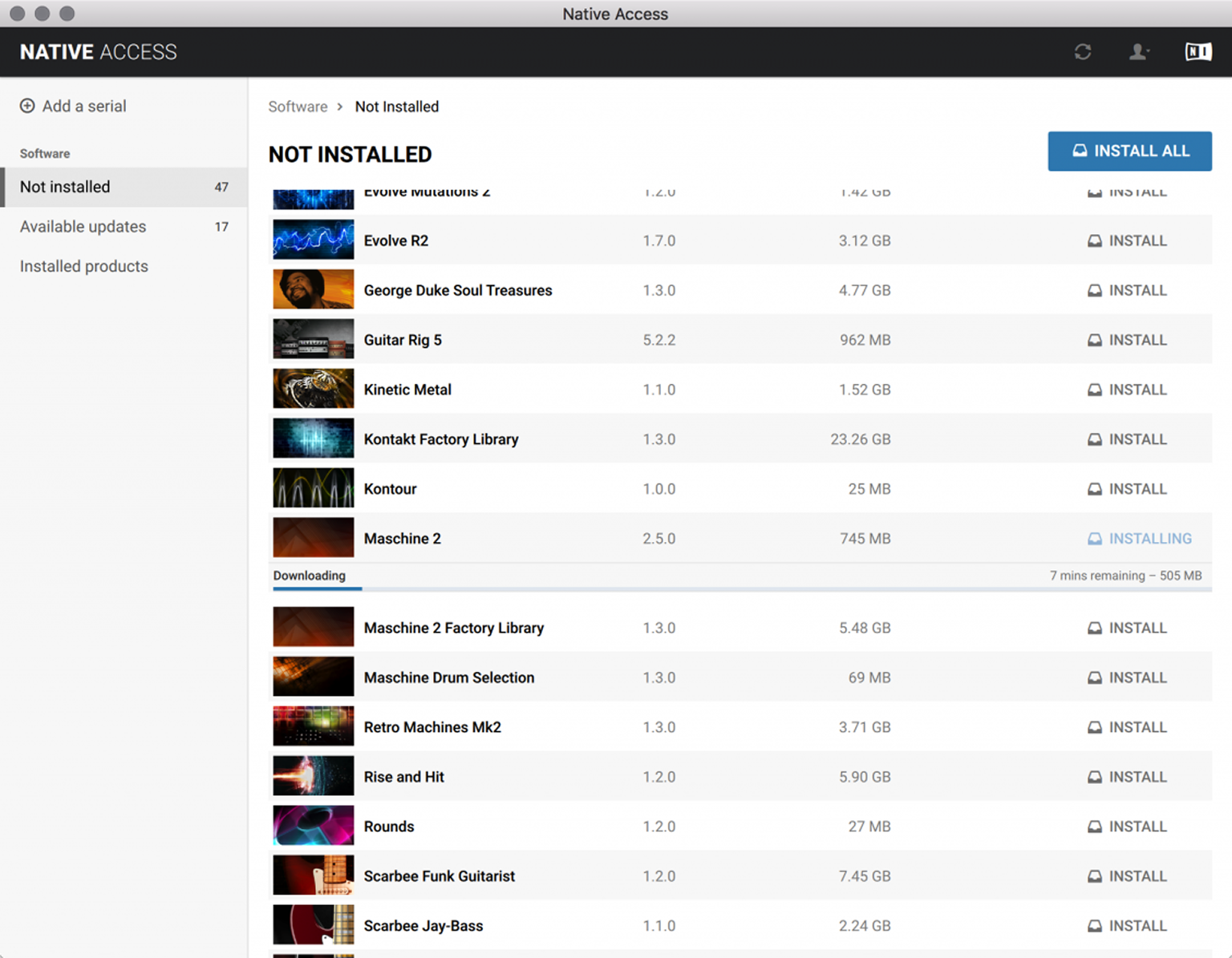
Originally designed as a simple installer, Native Access gradually evolved into a comprehensive product management application without changing its user experience.
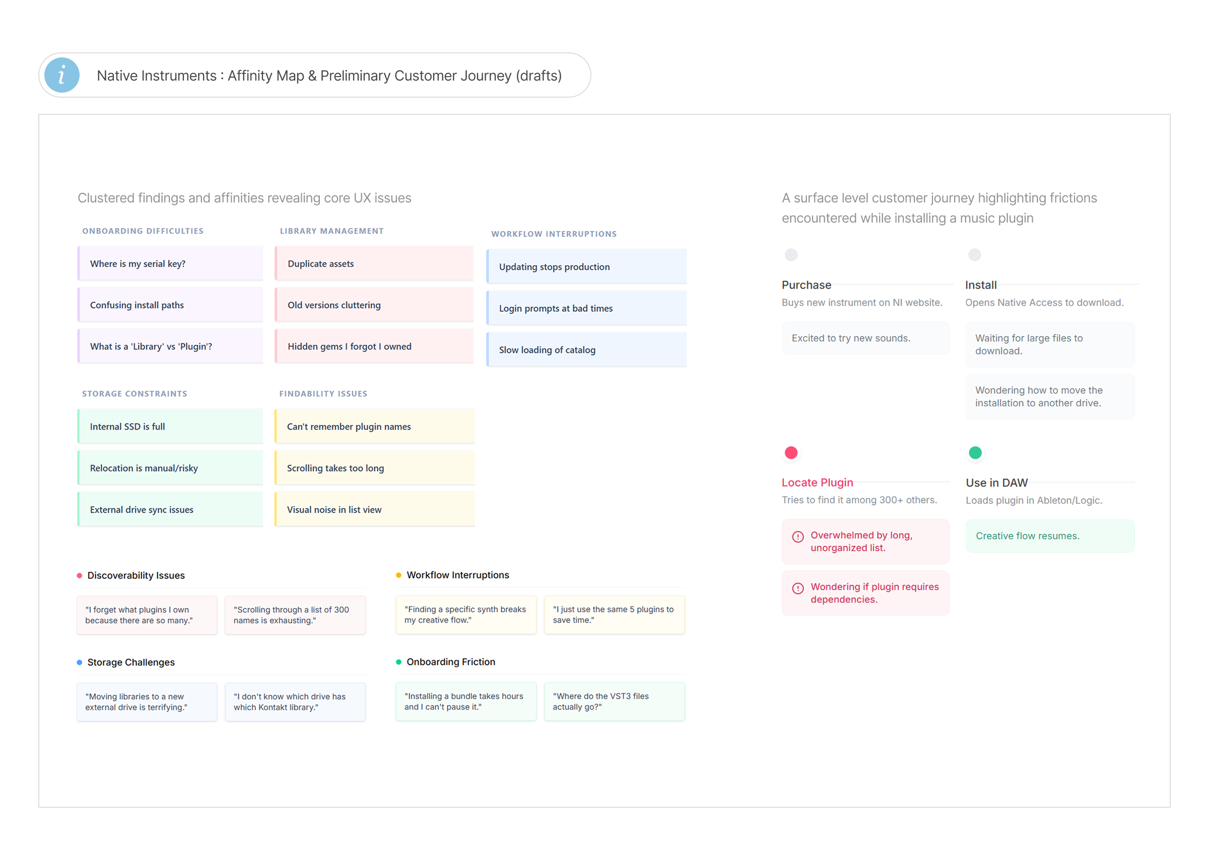
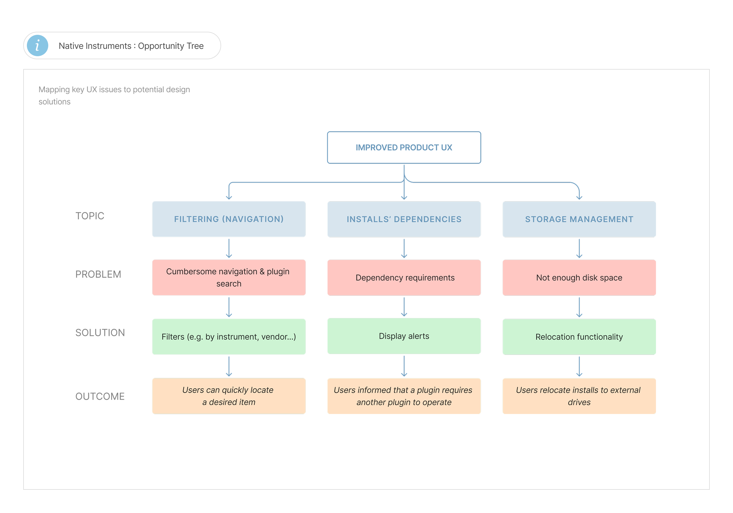
As customers expanded their audio plugin libraries, the application became difficult to navigate. Managing hundreds of plugins, virtual instruments, and sound libraries introduced friction throughout the experience, while growing technical complexity increased support costs and maintenance overhead. Users frequently struggled with:
Solution
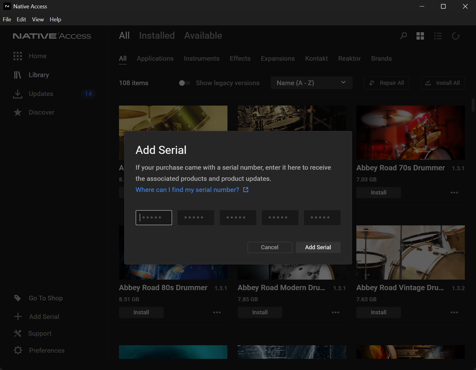
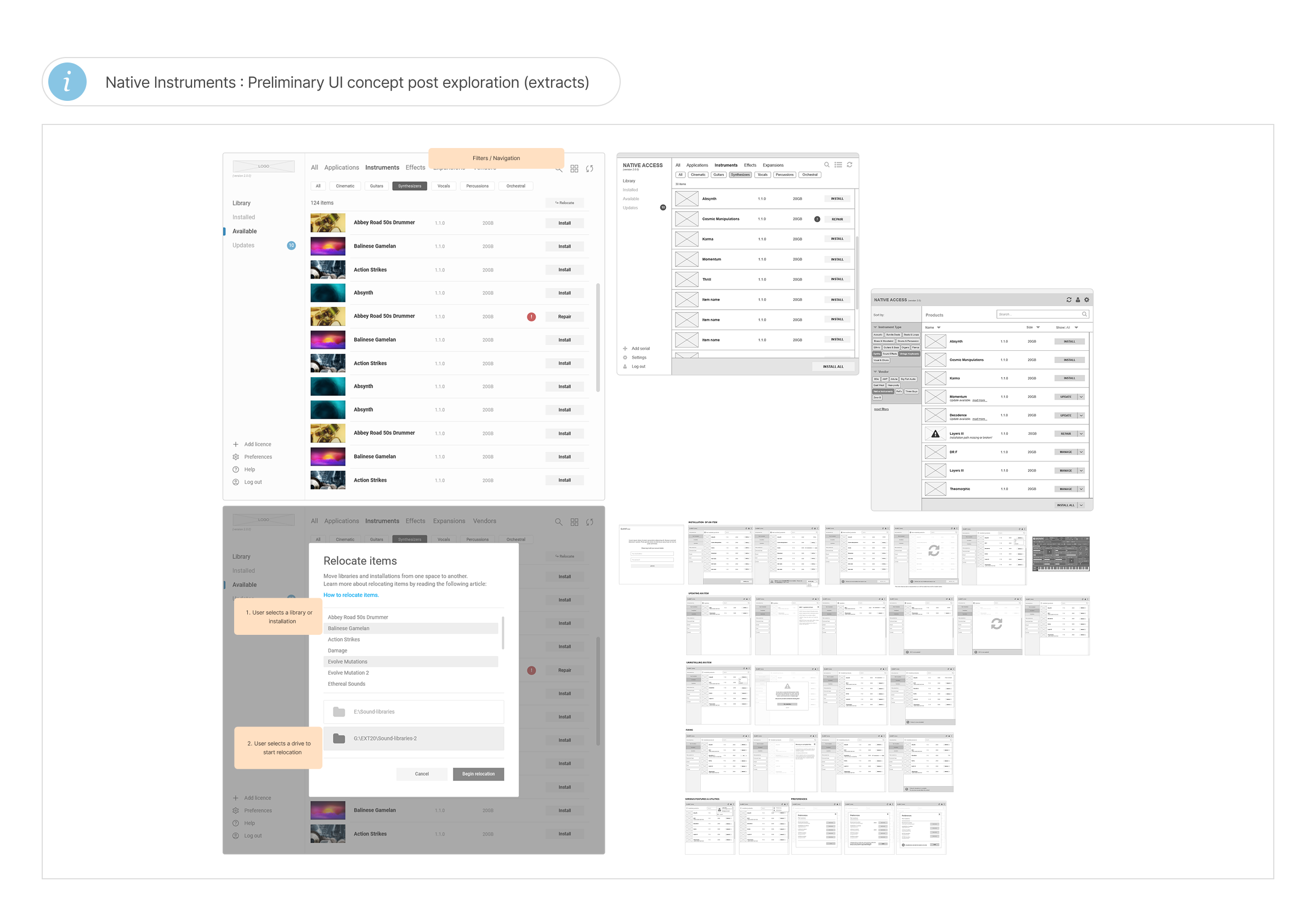
I led the redesign of Native Access into a modern product management experience, one enabling musicians and producers to efficiently organise, install, and maintain large collections of creative software. Rather than a disruptive overhaul, the approach focused on simplifying complex workflows while preserving the familiar interaction patterns that 1.5 million existing customers already relied on. The redesigned platform introduced:
The result was a scalable platform capable of supporting both new users finding their footing and professionals managing extensive software libraries.
Impact
My Role
Establishing context and understanding
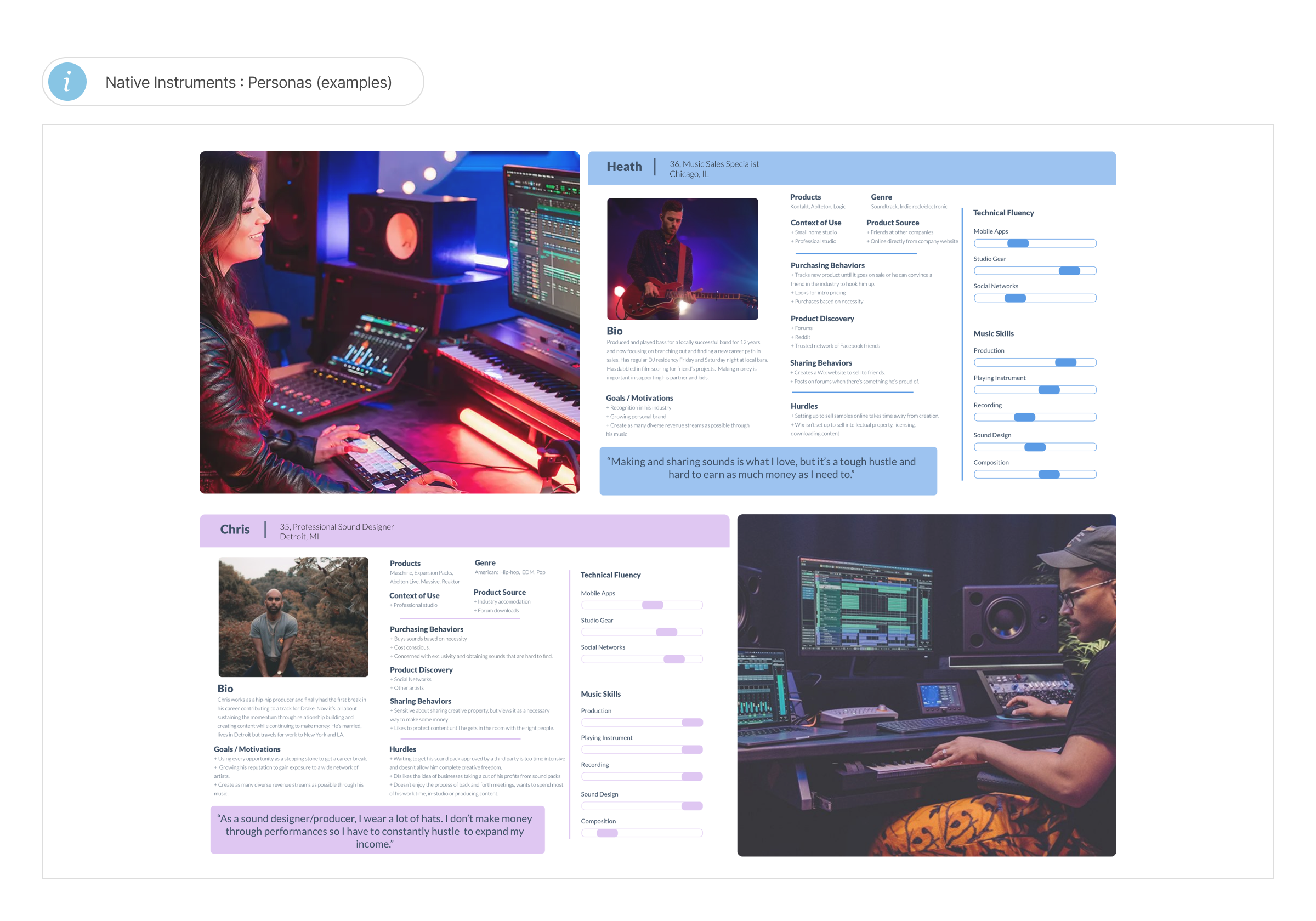
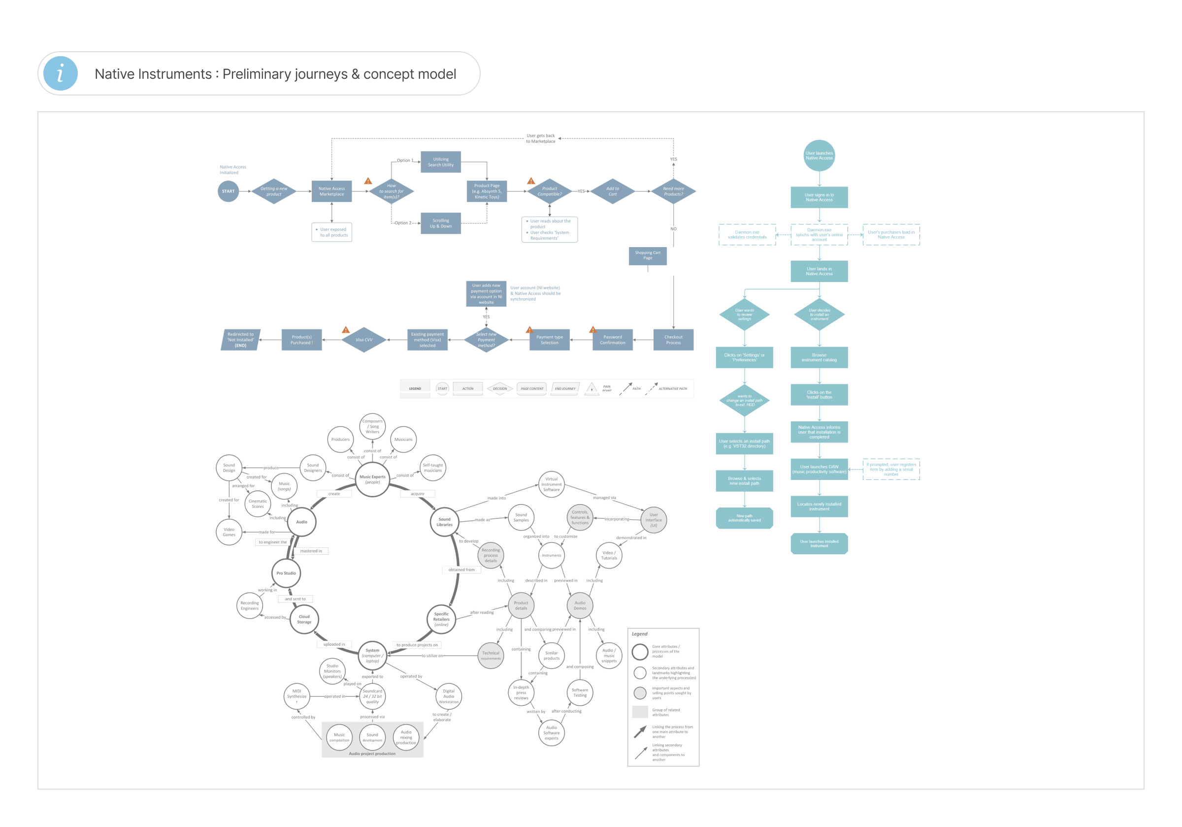
Working across my product team with a few designers from other product teams, I kickstarted this task by defining business objectives and establishing a roadmap. Next, I reviewed data comprising support feedback, analytics, and past research to obtain a clear picture of the general issues.
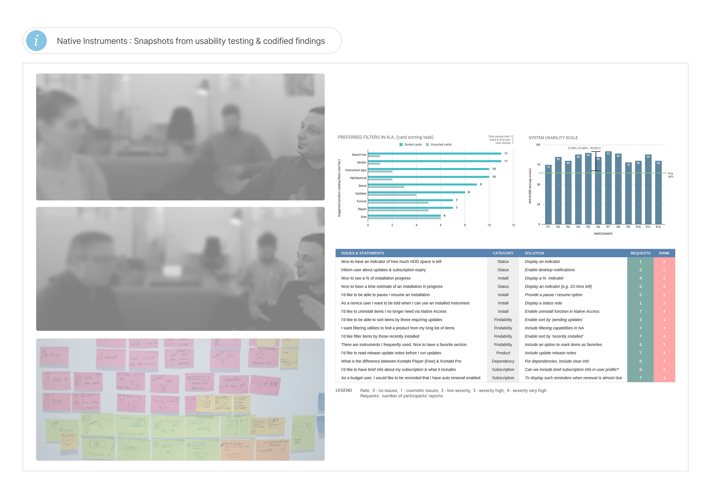
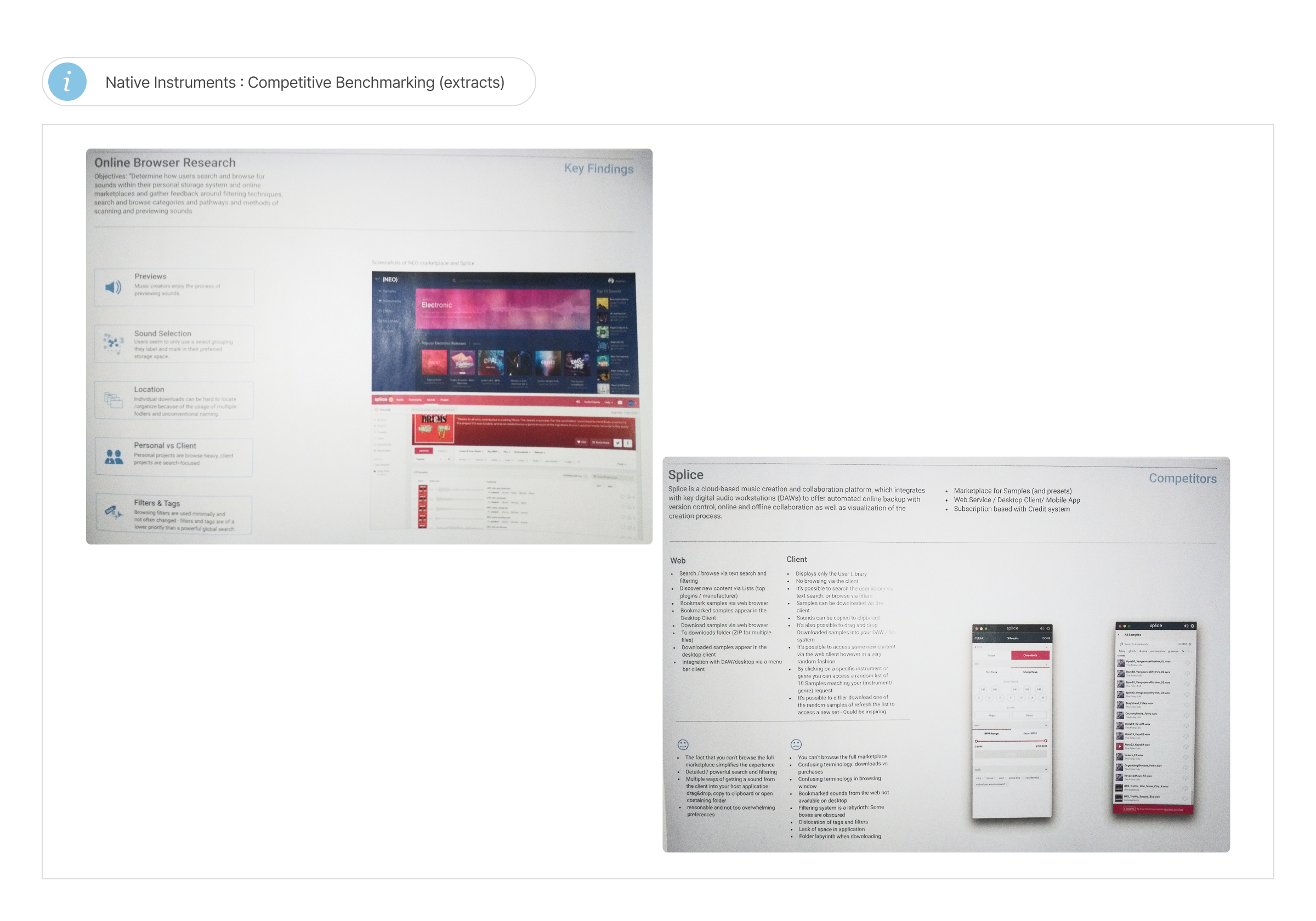
Moving forward, I ran a competitive analysis for a clear picture of where competitors perform better, followed by interviews with 15 customers to learn from their experience utilizing the product and where we can improve. Four key outcomes emerged:
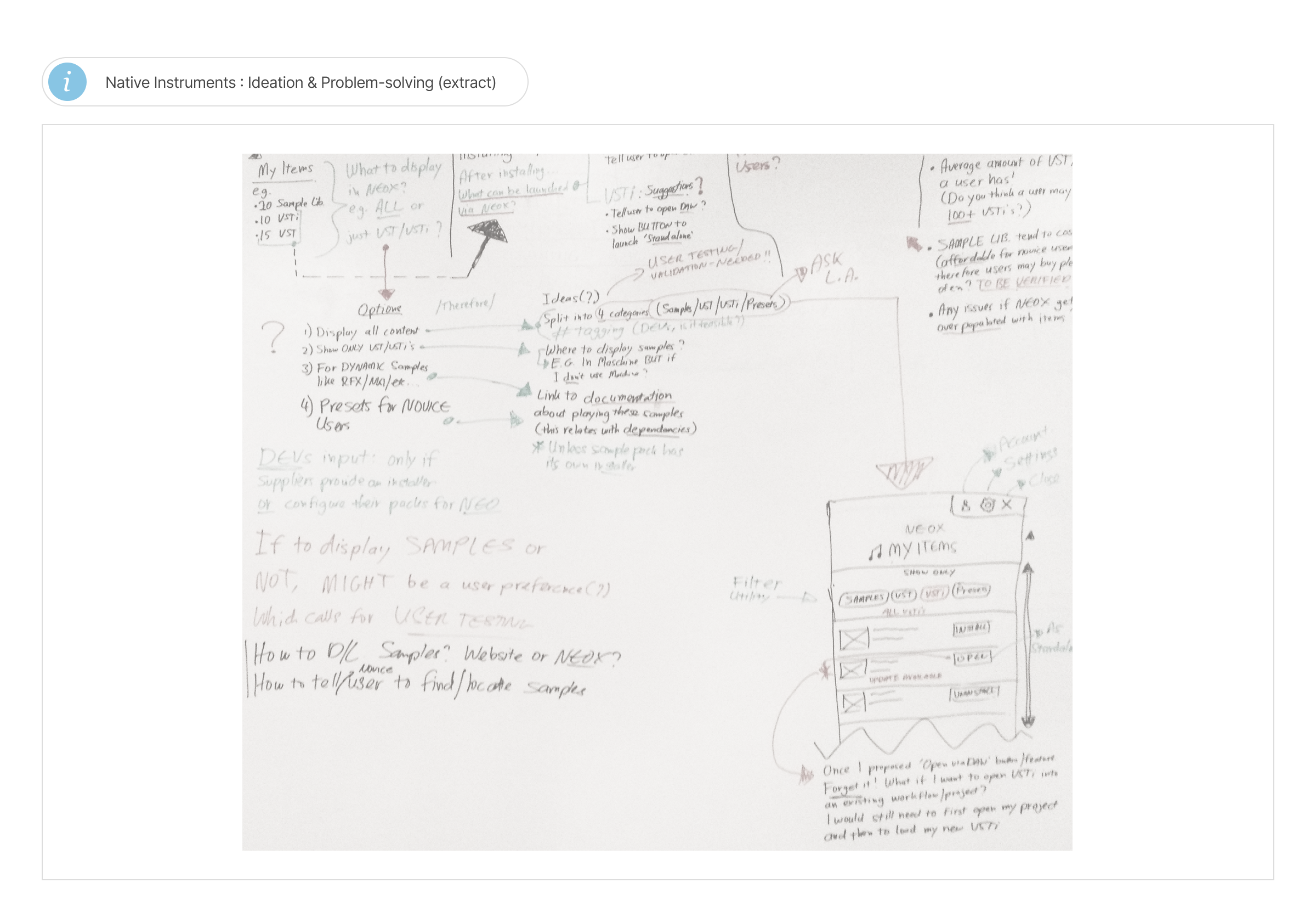
Exploring solutions grounded in evidence
With over 1.5 million existing users, the central challenge was balancing innovation with familiarity. A radical redesign could disrupt workflows users already relied on, so I emphasized retaining most of the product’s existing structure and touchpoints to protect users’ mental models and avoid steepening the learning curve.
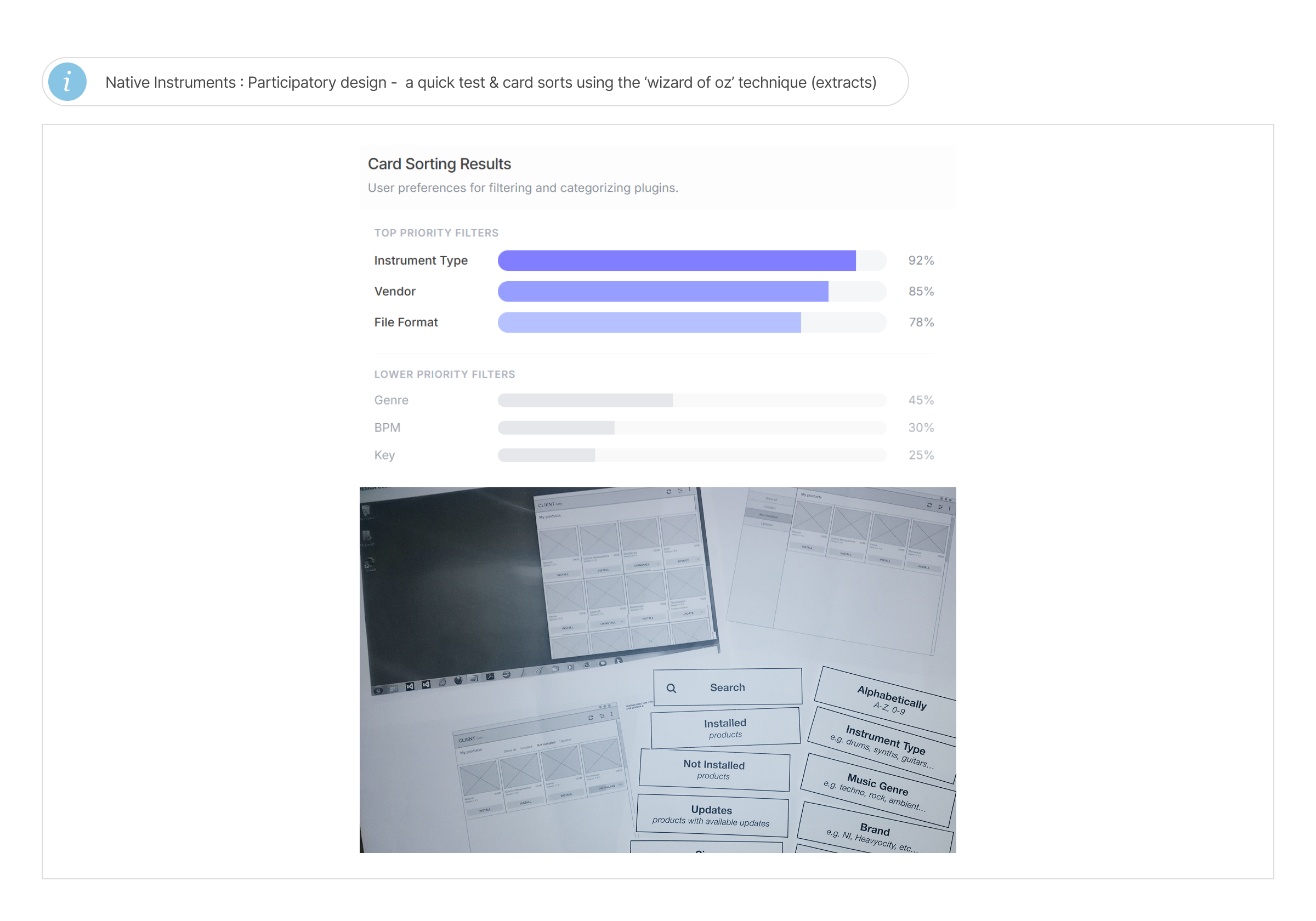
Through participatory design sessions with 5 music students, I progressively narrowed down a scalable product concept that was meaningful to users.
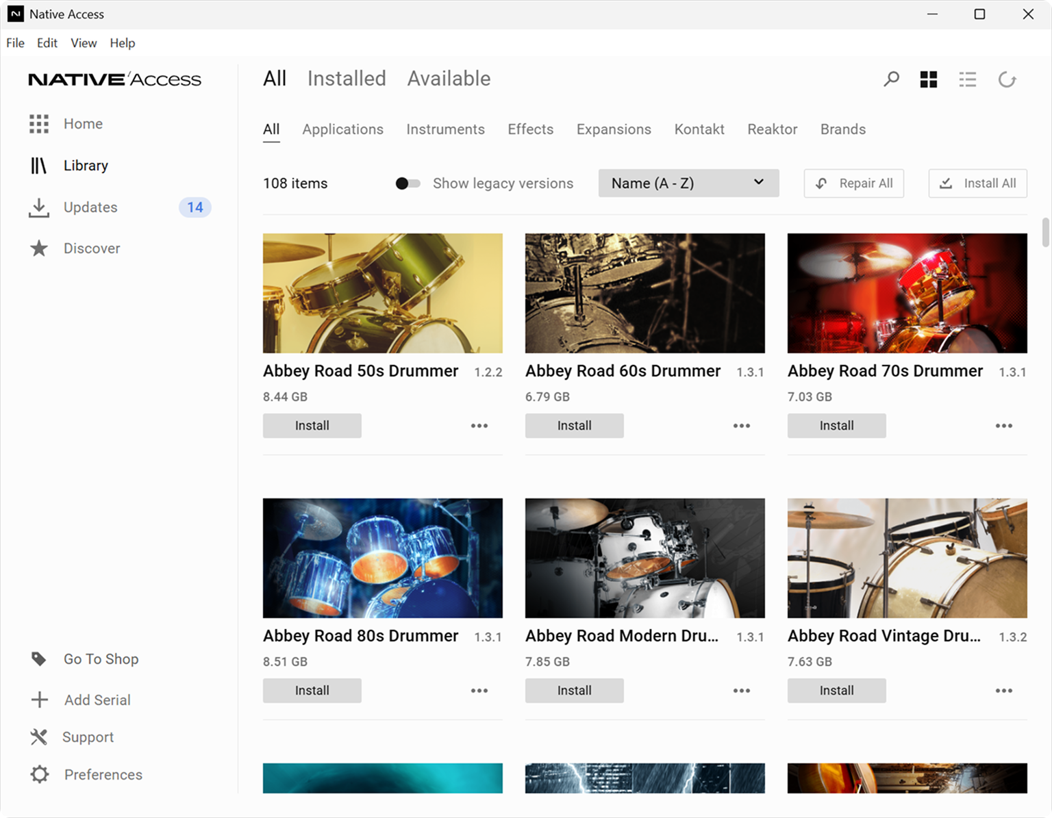
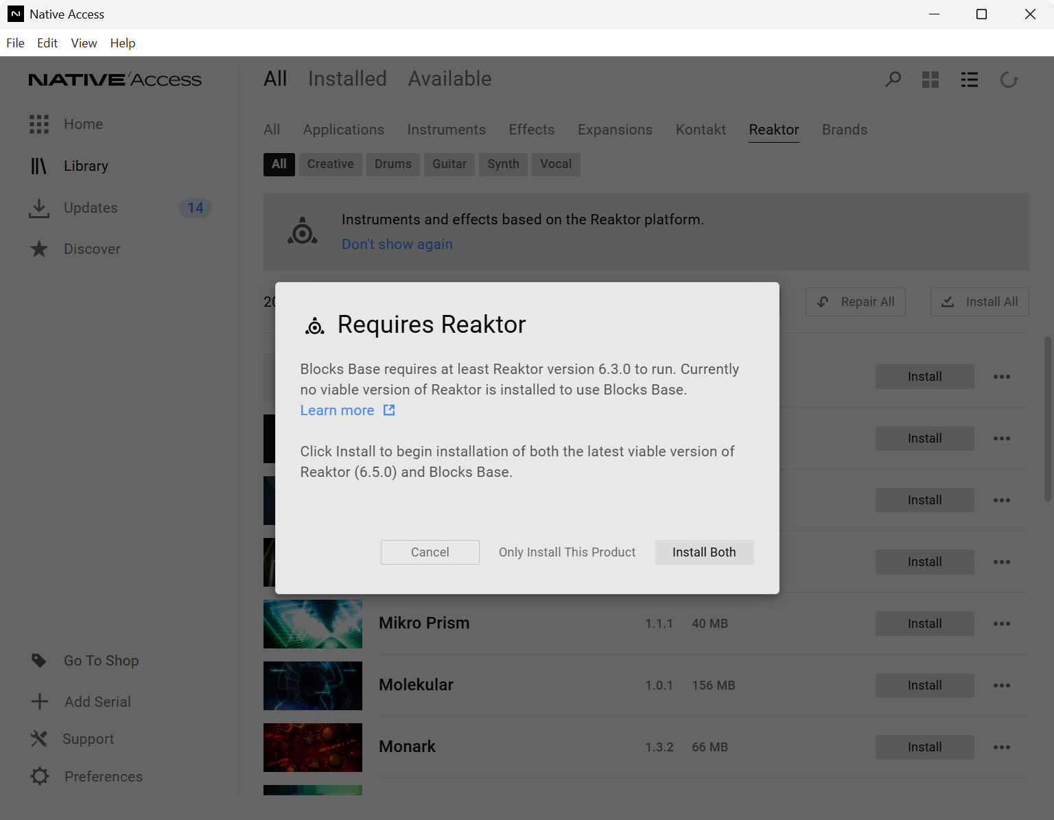
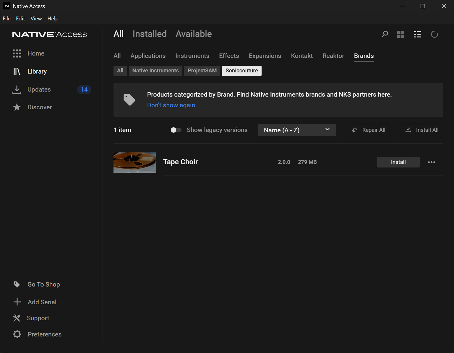
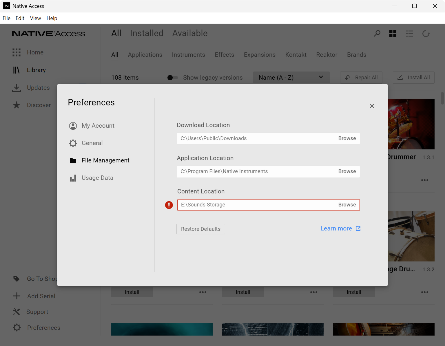
Moving forward, the final UI designs addressed key core problems including navigation redesign, inclusion of filtering (e.g. sort by instrument, vendor, etc.) to streamline discoverability, clear status messages surrounding errors and dependencies, and a novel feature I proposed, enabling users to relocate existing music productivity installations between hard drives while preserving internal system linking structure.
Every idea was validated against both usability and technical feasibility.
Designing around how users actually work
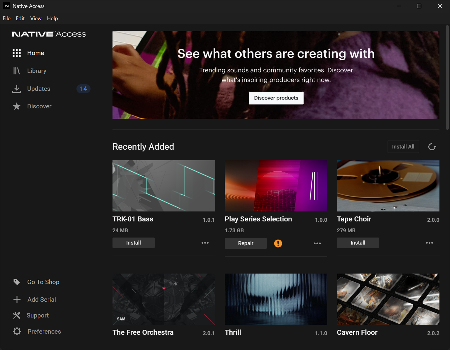
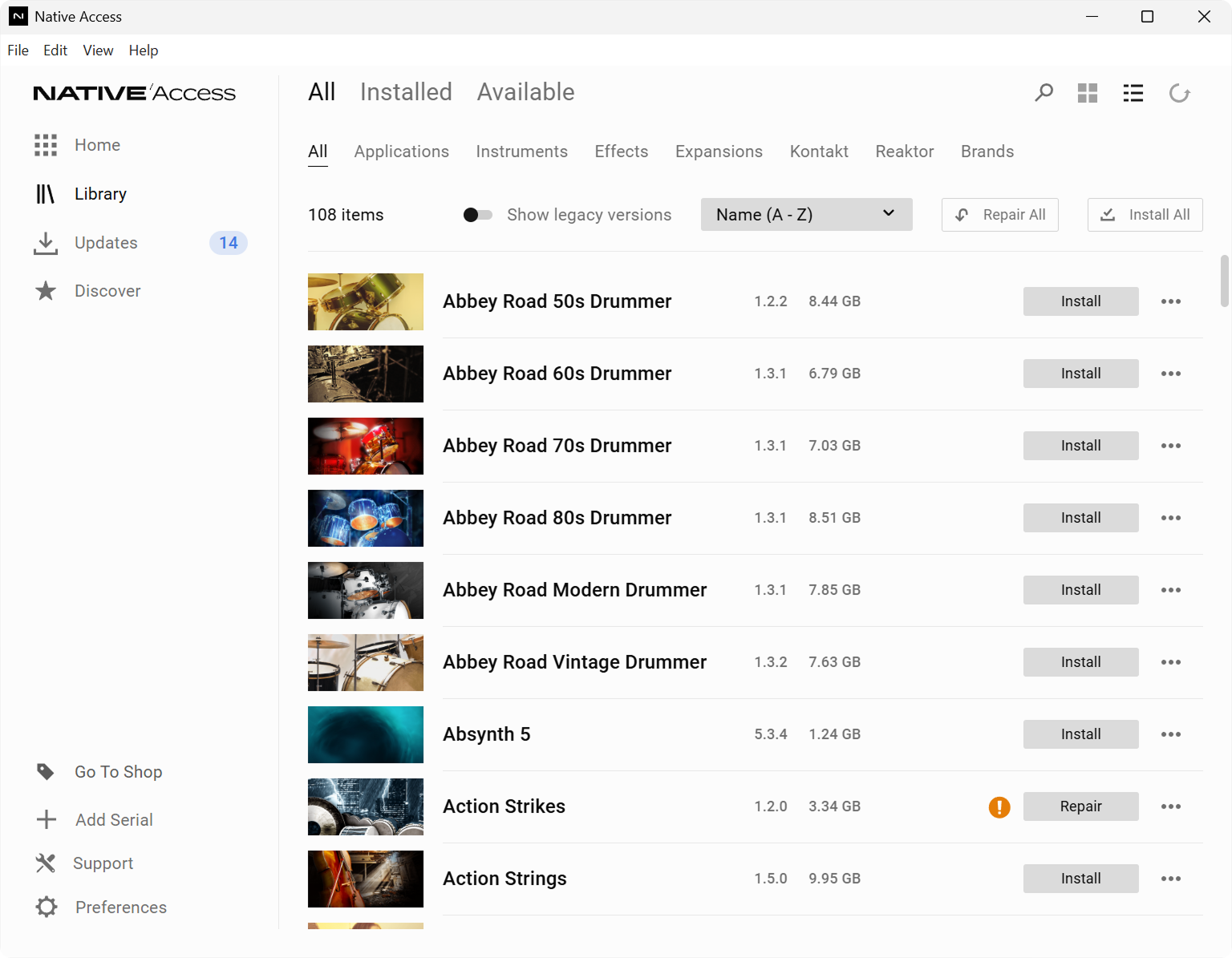
The redesigned Native Access desktop client transforms content and library management into a faster, intuitive experience for artists and sound designers at every level. Customers can discover products, manage installations, understand plugin dependencies, and relocate content libraries, all through capabilities designed around how users actually work.
The result is a desktop client tailored for both novice and power users owning hundreds of music assets within the same utility.
Showcase
Positive reception from users post validation